http://www.cdc.gov/pcd/issues/2007/oct/07_0091.htm
Univariate choropleth maps are used to show a single variable. The following map is showing the percentage of individuals that are living in poverty, by county.
Sunday, April 24, 2011
Bivariate Choropleth Map
http://proceedings.esri.com/library/userconf/proc99/proceed/papers/pap171/p171.htm
A bivariate map displays two variables on the same map. A bivariate map may consist of line features, polygon features, or point features. The map above is an bivariate map depicting the median house values in counties all over Ohio.
A bivariate map displays two variables on the same map. A bivariate map may consist of line features, polygon features, or point features. The map above is an bivariate map depicting the median house values in counties all over Ohio.
Classed Choropleth Map
http://www.esri.com/news/arcuser/1003/files/choropleth.pdf
In a classed choropleth map, you would use the bar to determine the height and shading or color intensity for each class. These maps generally include a frequency histogram, a frequency curve, and shading or coloring. The following classed map is depicting the divorce rate in the United States in 1990.
In a classed choropleth map, you would use the bar to determine the height and shading or color intensity for each class. These maps generally include a frequency histogram, a frequency curve, and shading or coloring. The following classed map is depicting the divorce rate in the United States in 1990.
Unclassed Choropleth Map
http://www.esri.com/news/arcuser/1003/files/choropleth.pdf
In an unclassed choropleth map that uses a frequency curve that varies the shading or color intensity from the lowest to the highest specified value. The following map is an example of an unclassed choropleth map showing the divorce rate in the United States in 1990.
Saturday, April 23, 2011
Bilateral Graph
http://www.energytribune.com/articles.cfm/676/Green-Energy-Advocate-Amory-Lovins-Guru-or-Fakir
A bilateral graph is a graph which shows the correlation between two or more different sets of variables. The following is considered a bilateral graph because is is using two variables, energy use per capital and energy use per dollar GDP to determine energy use throughout the United States.
A bilateral graph is a graph which shows the correlation between two or more different sets of variables. The following is considered a bilateral graph because is is using two variables, energy use per capital and energy use per dollar GDP to determine energy use throughout the United States.
Lorenz Curve
http://www.answers.com/topic/lorenz-curve
A lorenz curve is a graph formed by showing the concentration of ownership of certain economic quantities.
A lorenz curve is a graph formed by showing the concentration of ownership of certain economic quantities.
Index Value Plot
http://waterwatch.usgs.gov/new/?id=real&sid=w__plot
The following index value has been plotted using a line graph. This particular plot is showing the average stream flow over a two months span.
The following index value has been plotted using a line graph. This particular plot is showing the average stream flow over a two months span.
Time Series Plot
http://waterwatch.usgs.gov/new/?id=real&sid=w__plot
Time series plots represent and compare variables over a certain time span. The plot above is showing average streamline flow over a ten year period in the United States.
Time series plots represent and compare variables over a certain time span. The plot above is showing average streamline flow over a ten year period in the United States.
Scatterplot

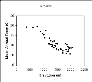
The graph above is showing data based on elevation and mean annual temperature for a number of places around Nevada.
Bar Graph
http://www.csupomona.edu/~jcclark/classes/bio256/b256a9.html
The following bar graph is depicting data for the maximum number of seats available for each lecture class during a spring semester in 1998.
The following bar graph is depicting data for the maximum number of seats available for each lecture class during a spring semester in 1998.
Population Profile
http://www.uni.edu/gai/India/India_Lesson_Plans/India_Population_Pyramids.htm
A population profile is a chart showing the number of people based on their ages. The profile above is showing the change in population between three countries. As you can see the United States currently is experiencing slow population growth.
A population profile is a chart showing the number of people based on their ages. The profile above is showing the change in population between three countries. As you can see the United States currently is experiencing slow population growth.
Climograph
http://www.uwsp.edu/geo/faculty/ritter/glossary/A_D/climograph.html
A climograph is a graphical illustration based on monthly precipitation and temperature conditions. The following climograph is of Memphis, Tennessee with precipitation for the area shown by the bar graph. Temperature is being shown by the use of a line graph.
A climograph is a graphical illustration based on monthly precipitation and temperature conditions. The following climograph is of Memphis, Tennessee with precipitation for the area shown by the bar graph. Temperature is being shown by the use of a line graph.
Stem and Leaf Plot
http://www.eduplace.com/math/mhm/5/06a/index.html
Stem and leaf plots are an extremely efficient way to display data. The following plot is depicting the age of 10 people sitting around a table. The stem as their ages and the leaf as the one digits.
Stem and leaf plots are an extremely efficient way to display data. The following plot is depicting the age of 10 people sitting around a table. The stem as their ages and the leaf as the one digits.
Triangular Plot
http://www.pmel.noaa.gov/maillists/tmap/ferret_users/fu_2007/msg00384.html
The following is a triangular plot the is illustrating tsunami waves. The plot above has three variables which each define horizontal and vertical axes. By using the plot above and studying the three variables, you can determine which wave trains will cause the greatest wave at which impact site.
The following is a triangular plot the is illustrating tsunami waves. The plot above has three variables which each define horizontal and vertical axes. By using the plot above and studying the three variables, you can determine which wave trains will cause the greatest wave at which impact site.
Parallel Coordinate Graph
http://vis.lbl.gov/Vignettes/Drosophila/index.html
Parallel coordinate graph is a way of visualizing high-dimensional geometry. The graph above is depicting the spatial relationships between different genes'. Each line is representing one cell-back-to-front.
Parallel coordinate graph is a way of visualizing high-dimensional geometry. The graph above is depicting the spatial relationships between different genes'. Each line is representing one cell-back-to-front.
Histogram
http://www.dpreview.com/learn/?/key=histogram
A histogram is a graphical representation representing a visual impression of some type of distribution of data. The histogram above indicates that there are a lot of pixels with value 0 or close to 0, which in this circumstance is an indication of a "clipped shadow."
A histogram is a graphical representation representing a visual impression of some type of distribution of data. The histogram above indicates that there are a lot of pixels with value 0 or close to 0, which in this circumstance is an indication of a "clipped shadow."
Friday, April 22, 2011
Windrose
http://climate.met.psu.edu/features/PA_WIND_ROSES/windrose.php
The map above is depicting wind roses for 11 secondary Pennsylvania airports. .
The map above is depicting wind roses for 11 secondary Pennsylvania airports. .
Box Plot
http://www.itl.nist.gov/div898/handbook/eda/section3/boxplot.htm
Box plots are an excellent tool for detecting and illustrating location and variation changes between different groups of data. The plot above is comparing four machines against their energy output.
Box plots are an excellent tool for detecting and illustrating location and variation changes between different groups of data. The plot above is comparing four machines against their energy output.
Similarity Matrix
http://www.fxpal.com/?p=eventDetector
The matrix above is showing the temporal similarity of a collection of 512 photos.
The matrix above is showing the temporal similarity of a collection of 512 photos.
Correlation Matrix
http://yin.che.wisc.edu/images.htm
A correlation matrix map shows the corresponding similarities between two similar entitles. shown above is a calculated protein correlation matrix for phage T7.
A correlation matrix map shows the corresponding similarities between two similar entitles. shown above is a calculated protein correlation matrix for phage T7.
Star Plots
http://start1.jpl.nasa.gov/caseStudies/autoTool.cfm
Star plots are a way of displaying multivariate data. Each star represents a single observation. In the star plot above, the center represents the most desirable result.
Star plots are a way of displaying multivariate data. Each star represents a single observation. In the star plot above, the center represents the most desirable result.
Range Graded Proportional Circle Map
http://www.d.umn.edu/geog/cartfolder/HTML%20Pages/Prop-Symbol3.htm
A range graded proportional circle map that represents circles which are made in relation to range of data. The map above is of Africa and is showing its population density based upon circles.
A range graded proportional circle map that represents circles which are made in relation to range of data. The map above is of Africa and is showing its population density based upon circles.
DLG
http://geography.wr.usgs.gov/sfcreek/dlg.html
Digital line Graphs from USGS topographic maps display digital vector representations of cartographic information.
Digital line Graphs from USGS topographic maps display digital vector representations of cartographic information.
Continuously Variable Proportional Circle Map
http://techcrunch.com/2008/08/13/search-geo-data-with-finder-plus-sneak-peak-at-geocommons-map-maker/
The the following Continuously Variable Proportional Circle map data is being depicted by using dots that are proportional in scale and location of the information being represented. The map above is showing carbon emissions from Chinese power plants.
The the following Continuously Variable Proportional Circle map data is being depicted by using dots that are proportional in scale and location of the information being represented. The map above is showing carbon emissions from Chinese power plants.
DOQQ

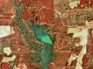
DOQQs or Digital Orthophoto Quarter Quads are digital areal images produced by the USGS. They generally contain orthorectified aerial photography at a resolution of 1 meter. The map above is a color infrared DOQQ of Johnston County in 1998.
DEM
http://eros.usgs.gov/#/Find_Data/Products_and_Data_Available/DEMs
The map above is an Digital Elevation model of Sturgis, SD. DEMS use a raster grid of regularly spaced elevation values, which is taken from the USGS topographic map series.
The map above is an Digital Elevation model of Sturgis, SD. DEMS use a raster grid of regularly spaced elevation values, which is taken from the USGS topographic map series.
Monday, April 18, 2011
DRG
http://egsc.usgs.gov/isb/pubs/factsheets/fs08801.html
A digital raster graphic or DRG is an image scanned from a U.S. Geological Survey topographic map. The map above is a partial DRG of Washington, D.C.
A digital raster graphic or DRG is an image scanned from a U.S. Geological Survey topographic map. The map above is a partial DRG of Washington, D.C.
Isopleths
http://www.cbr.washington.edu/papers/jim/draft.html
Isopleths are contour lines on a map which connect points of the same value. The map above is depicting isopleths of north-south coastal wind velocity by month and latitude. By looking at the isopleths you can determine that the positive velocity is associated with the winter and fall seasons. The negative velocity is associated with summer and spring.
Isopleths are contour lines on a map which connect points of the same value. The map above is depicting isopleths of north-south coastal wind velocity by month and latitude. By looking at the isopleths you can determine that the positive velocity is associated with the winter and fall seasons. The negative velocity is associated with summer and spring.
Isopach
http://www.glossary.oilfield.slb.com/DisplayImage.cfm?ID=114
Isopachs are a form of contour lines which show areas of equal thickness. By using the map above and looking at the isopachs you can determine that the area in the middle is not only the deepest but the thickest as well.
Isopachs are a form of contour lines which show areas of equal thickness. By using the map above and looking at the isopachs you can determine that the area in the middle is not only the deepest but the thickest as well.
Isohyets
http://www.info.bw/~mettest/bulletins/data/bulletin_0210/bulletin_0210.html
Isohyets are a form of isobar. It uses a line which connects points on a map having the same amount of rainfall in a given period. The Map above is featuring isohyets which are showing long-term rainfall. Each line corresponds to a certain rainfall amount in millimetres.
Isohyets are a form of isobar. It uses a line which connects points on a map having the same amount of rainfall in a given period. The Map above is featuring isohyets which are showing long-term rainfall. Each line corresponds to a certain rainfall amount in millimetres.
Isobar

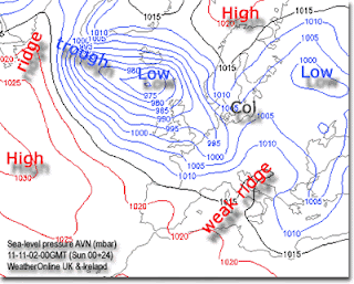
Isobar map features lines which join points of equal mean-sea-level-pressure. Isobar maps are extremely useful due to their ability to show elevations at a certain location. The map above is showing the elevation of UK and Ireland. By looking at the isobars above, you would easily be able to locate which locations are higher than others.
Sunday, April 17, 2011
LIDAR
http://www.treehugger.com/files/2007/06/3-d_forest_mapping.php
LIDAR maps, or light detection and ranging, provide detailed information about a particular landscape than does a normal aerial photo. The type of data collected is used to make a 3-D map of a certain area. The map above is a LIDAR Map of a forest which gives accurate measurements of the forest floor and tree heights. This new type of technology has become extremely handy for conservationists worldwide.
LIDAR maps, or light detection and ranging, provide detailed information about a particular landscape than does a normal aerial photo. The type of data collected is used to make a 3-D map of a certain area. The map above is a LIDAR Map of a forest which gives accurate measurements of the forest floor and tree heights. This new type of technology has become extremely handy for conservationists worldwide.
Doppler Radar
The doppler radar is a specialized radar which uses a microwave signal sent toward a specific target. Once the reflection is received, the objects motion and density can be calculated. This type of radar is extremely valuable to everyone around the world, without it, it would be hard to locate hurricanes, tornadoes, and other major storms. The Doppler radar photo above is a screen shot of Tallahassee, Fl on April 17, 2011. Currently, as you can see its clear, with no cloud coverage.
Black and White Aerial Photo
http://egsc.usgs.gov/isb/pubs/booklets/aerial/aerial.html
Aerial photography is developed by exposing film to solar energy which is reflected from the earth. Today black and white films are used in both high and low altitude aerial photography. The photo above is a black and white aerial shot of Los Angeles, California.
Aerial photography is developed by exposing film to solar energy which is reflected from the earth. Today black and white films are used in both high and low altitude aerial photography. The photo above is a black and white aerial shot of Los Angeles, California.
Infrared Aerial Photo
http://www.aerialarchives.com/infrared.htm
Infrared aerial photography is an extremely valuable resource. It can be used to map a large range of applications. These types of photos are using a special type of film which is sensitive to a certain portion of light. The photo above is an infrared photo of the Sacramento Deep Water Channel in California.
Infrared aerial photography is an extremely valuable resource. It can be used to map a large range of applications. These types of photos are using a special type of film which is sensitive to a certain portion of light. The photo above is an infrared photo of the Sacramento Deep Water Channel in California.
Cartographic Animation
http://libraries.maine.edu/Spatial/gisweb/spatdb/gis-lis/gi94078.html
In cartographic animation, the animation part is usually depicted as change over time. The map above is a cartographic animation which is depicting the change in the percent of population over 65 in the United States.
In cartographic animation, the animation part is usually depicted as change over time. The map above is a cartographic animation which is depicting the change in the percent of population over 65 in the United States.
Statistical Map
http://personalpages.manchester.ac.uk/staff/m.dodge/cybergeography/atlas/census.html
Statistical maps are unique types of maps with an extremely broad range of applications. A statistical map is one which depicts facts in numbers in the form of symbols. The statistical map above is showing the spread of the internet throughout Africa. This map is a good example of this map type because it is using percentages to show which areas have increases or decreases their usage.
Proportional Circle Map
http://geographyfieldwork.com/DataPresentationMappingTechniques.htm
Proportional circle maps use symbols that are drawn proportional in size to the size of the object being depicted. The map above is a proportional symbol map representing the voting register for the Czech Republic. The areas which the largest circles represent areas with the most registered voters.
Proportional circle maps use symbols that are drawn proportional in size to the size of the object being depicted. The map above is a proportional symbol map representing the voting register for the Czech Republic. The areas which the largest circles represent areas with the most registered voters.
Choropleth Map
http://my.ilstu.edu/~jrcarter/Geo204/Choro/Tom/
Choropleth maps are a type of thematic map which uses aerial units to depict information. Usually in the form of multi-colored checkered patterns. The map above shows the percent of people who are hispanic per county in Florida.
Choropleth maps are a type of thematic map which uses aerial units to depict information. Usually in the form of multi-colored checkered patterns. The map above shows the percent of people who are hispanic per county in Florida.
Propaganda Map
http://longstreet.typepad.com/thesciencebookstore/2008/08/propaganda-maps.html
Propaganda maps are used to help spread the ideas and information around in a unique way. These types of maps were used to influence people into performing certain actions. This was a propaganda map generated by the Nazi's and depicted the threat posed by the rest of the world to the German nation.
Propaganda maps are used to help spread the ideas and information around in a unique way. These types of maps were used to influence people into performing certain actions. This was a propaganda map generated by the Nazi's and depicted the threat posed by the rest of the world to the German nation.
Dot distribution Maps
http://www.flatrock.org.nz/topics/new_jersey/where_do_they_live_and_what_do_they_do.htm
A dot map is a map type which uses dot symbols to show the presence of a particular feature. This is a dot map which represents the location of people throughout New York State. As evident in the map, the highest concentration of people is in the northeast part of the state.
A dot map is a map type which uses dot symbols to show the presence of a particular feature. This is a dot map which represents the location of people throughout New York State. As evident in the map, the highest concentration of people is in the northeast part of the state.
Monday, April 11, 2011
Hypsometric Map
http://www.kvitters.com/search/Aegean%20Sea
Hypsometric maps show elevation of terrain with colors. These types of maps show relief by means of contour lines, shading, or tinting.
Hypsometric maps show elevation of terrain with colors. These types of maps show relief by means of contour lines, shading, or tinting.
Planimetric Map
http://www.ncdot.org/doh/preconstruct/highway/photo/Products/Planimetric_maps_default.html
Planimetric maps are digital, graphic maps that portray horizontal positions using symbols and lines. Planimetric maps are mainly used for preliminary design oft transportation projects. The map above is depicting bus routs in a major city.
Planimetric maps are digital, graphic maps that portray horizontal positions using symbols and lines. Planimetric maps are mainly used for preliminary design oft transportation projects. The map above is depicting bus routs in a major city.
Cartograms
http://en.wikipedia.org/wiki/File:Cartlinearlarge.png
A cartogram is a thematic map type. The geometry of space of the these types of maps are distorted in order to help convey the information. This particular map is depicting popular votes in the 2004 US Presidential election. The size of the counties have been rescaled according their each individual population.
A cartogram is a thematic map type. The geometry of space of the these types of maps are distorted in order to help convey the information. This particular map is depicting popular votes in the 2004 US Presidential election. The size of the counties have been rescaled according their each individual population.
Flow Map
http://www.mundi.net/maps/maps_014/
Flow maps have been extremely important in cartography due to their ability of mapping the flows of goods, people, and diseases. The map above is a flow map made by TeleGeography which mapped the usage of the net based on the volume of international telephone traffic between nations. This particular map above is depicting network usage throughout the European region.
Flow maps have been extremely important in cartography due to their ability of mapping the flows of goods, people, and diseases. The map above is a flow map made by TeleGeography which mapped the usage of the net based on the volume of international telephone traffic between nations. This particular map above is depicting network usage throughout the European region.
Isoline Map

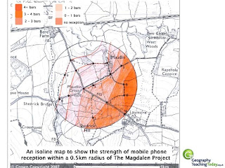
Isoline Maps like the one above are examples of a different type of thematic map. Isoline map shows continuos lines of the same value. The map above is depicting mobile phone reception over a certain geographical area.
Sunday, March 13, 2011
PLSS Map

A PLSS is a way of subdividing and describing land. Is used to divide public domain lands which is land owned by the Federal government and used by the citizens of the United States. This particular map is based off meridians and base lines, and was compiled by bring together a couple different surveys.
Cadastral Map

This is an image of an cadastral map. A cadastral map provides detailed information about real property within a specific area. These maps clearly show land ownership distribution. This is a map of early real property distribution, which was created in 1910 by the Alameda Land Company.
Thematic Map of Mexico Climate

A thematic map is specifically designed to show a particular theme. In this map the theme is Mexico's climate and which regions are prone to dryer seasons and which regions receive more rain. A thematic map like this is extremely valuable to a farmer and to many other professions. A thematic map can be made to show many different themes.
Topographic map

http://commons.wikimedia.org/wiki/Media:Florida_topographic_map-en.svg
Subscribe to:
Posts (Atom)


