Stephen's Map Catalog
Saturday, April 23, 2011
Scatterplot
http://www.csupomona.edu/~jcclark/classes/bio256/b256a9.html
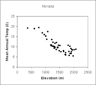
The graph above is showing data based on elevation and mean annual temperature for a number of places around Nevada.
No comments:
Post a Comment
Newer Post
Older Post
Home
Subscribe to:
Post Comments (Atom)
No comments:
Post a Comment